Monday, September 2, 2013

Prayer Flags

The side trade for last month, (yes I am late again) was a prayer flag. I had never done one before and stupidly went searching on the internet for examples. Well there are some beautiful examples out there and before I knew it, I was too intimidated to try. That's not entirely true. I did start but forgot what direction I was going with it and stopped. I stopped for the whole month! Deadlines are wonderful motivators to finish things off. That and school starting, a new job and less time.


The piece started with a dark painted background in indigo and burgundy. I decided it needed some more lively colors and added in lemon yellow, hot pink, lime green and sky blue. There was quite a bit of paint on that so I scratched in the words peace, hope, love and prosperity. I think that covers the bulk of prayers. I added in a metallic burgundy heart at the top but didn't want it so cutesy and added in some dark blue to add dimension. I also added additional burgundy into the background of the flags for more interest. The only thing I did wrong with this was not to make one for myself. I guess this means I have to try it again.

Wednesday, August 7, 2013

August ATC Trade - Butterfly

This was a theme idea that I was excited about but worried about. I loved the idea because butterflies are so colorful and fun but didn't want to do an ATC with a picture of a butterfly. I have promised to stretch myself and these trades are very helpful. If you google images of butterflies, you get so many different types and it amazes me that I only see a few versions! But a few caught my attention when looking at them up close. The patterns on some have spots on the bottom wings that look to me like eyes. I love eyes and I love drawing them. They are so expressive. There was my starting point!


Each piece is on card stock. The eye was sketched in first with a light pencil and then a pattern was created around each. I colored in each with Sharpie markers! I never thought I would ever draw with markers but I love the details and colors I can get when overlaying. If I ever win lotto, I will buy sharpies in every color! Well after the color went on, I outlined everything with a finepoint black micron pen. For the eye centers, I used black puffy paint but left it flat so it would be shiny black. Additional details were made using glitter glue. I just couldn't pick a favorite to showcase so you only get the group shot.

Next up is my prayer flag trade but still struggling with ideas so it may be a while!

Thursday, July 11, 2013

I think I have a problem!

One of the side trades in our group was to do a 6" x 6" mixed media piece which included hand stitching. The inspiration came from the challenge posted in Cloth, Paper, Scissors magazine. If we love what we made, then we could in turn, enter it into the challenge.

I was not prepared for how much I would love the size! I have finished four and have another four more in the works!


This one was inspired by all the rain we have had. At the end of my driveway is a small hole that fills with water whenever it rains. I noticed a leaf at the bottom and was intrigued to recreate it. I drew the shape of the puddle first and using tissue paper and gel medium, I created a rock texture around the hole. After it was dry, I used various acrylic paint colors to get the color I wanted. The bottom of the water was painted in dark blue with a wash of brown over it. The leaf was created from a cotton face pad. Did you know you can dye them?!! I have a bunch so cut out a leaf shape and using my sewing machine, I sewed veins. I actually hated the top side and flipped it over. This was much better. A few beads and then dimensional magic by Modge Podge created the water. I love this stuff! I hand sewed a few leaf shape beads on top for the complete finish.


Was playing around with sketching on canvas for this one. Then I was coloring it with oil pastels. You know that point where you hate what you are doing so you cover it up?! Don't lie. OK go ahead. Well I hated it and painted over it with white acrylic paint. Don't you love crazy things like that? I loved the look because some of what I had was still peeking through! So back in with pencil and oil pastels. I loved how it looked! Yes her eyes look cross eyed and one is bigger than the other, but the technique was very cool. I will be trying it again.


So my sister thinks this is creepy because she is green. Well that's because she is a mermaid! In my world, mermaids are green! I sketched her out on the canvas and well yes she is disproportionate too. Try drawing on untreated canvas. Not so easy. I painted her with fabric paints and then sewed in details on my machine. Her eyebrows look like small caterpillars but I still like them. In face reading, big eyebrows indicate intelligence! So she's smart! I added more details with fabric markers and then added dimensional magic all the way around her face. When it dried, I added in rings of the dimensional magic. After that was dried, I used interference blue paint on top and dark blue markers around the edges to create ripples of water. Is she looking up from the water or down at her reflection?


This was actually the first one I made. It was a bit like my ATC I created. This is actually canvas, thin batting and then brown fabric on top. I free motion quilted the rocks and sand. Then using sheer fabrics in brown and blue, I sewed them down to make waves. Using fabric paint, I added details into the rocks and created a sandy section using sand gel medium. Fabric paints finished off the sand. The waves were touched with the interference blue. I wanted to created water sloshing up onto the shore and used, you guessed it, dimensional magic! Interfence paint was applied to the edges of the water waves.

So those are my first four attempts. Stay tuned as more are coming!

Graffiti ATC - Typography

Yeah! New trade theme! Typography! Wait what?!! Oh man. Now I have to move outside the comfort zone again! (insert moaning and gnashing of teeth here!) Don't get me wrong. I love typography - when someone else does it. But when I have to do it - well it has to be perfect and I can't do perfection . . . .   Ok OK so the award for best dramatic performance goes to  ME!! LOL

I am actually pretty pleased with my interpretation of this theme. If you want to check out the others versions, swing on by our blog!


Graffiti is a cool version of typography that I can't really screw up too badly, so I sketched in the words heARTist trading group with a pencil and then traced with an embossing pen. Black embossing powder was sprinkled on top, then heat set. Sharpie markers added the colors. I outlined everything with a black sharpie to add dimension and with oil pastels to highlight. They were pretty good but I can never leave well enough alone. I painted Patty was here because I'm in the group, because I can and in graffiti, someone always comes along and messes with the masterpiece.

Friday, June 21, 2013

June Side Trade - gift tags

Have you ever seen something really cool and think you want to try it. So you go to the store and buy all the materials to make it and then chicken out or just forget about it? No? Me either! Well that's not true. Digging through my supplies, I found packages of different sized gift tags. Whoops. Good thing this challenge came along! So we had to make two different styles to trade. Easy enough. Uh no. It's something new so I have to suffer anxiety over it.

Time to just count out what I need and plow in with materials!


This first set evolved over my dismay at not having achieved a summer day yet! I mean it's almost the end of June and we are barely above 70 this summer! Well my card worked. The projected temps for the next week are in the 90's! 
The sand is from the liquitex sand medium, then dye painted over it. The sky is ink and clouds painted in with acrylic. A hand carved bird stamp and grass stamp complete the look.


Now this tag was a technique driven design. I had some metallic paint from my faux finishing days. It was a sage green color and I troweled it on and stamped into it. That part kind of disappeared. I painted a sunflower yellow ink over the top. Still boring, so I used a stencil in dark purple along the edge, then splattered white acrylic paint with a toothbrush. Next a rubber stamp in sunflower yellow on the opposite side. Dragonfly kept running through my head the entire time I worked on this piece. On a separate piece of paper, I stamped a bunch of dragonflies and used embossing powder in black. When dry, I heat set then colored with markers. I trimmed around the outside edges and glued them to each tag. Still needed just one more element. Black glitter glue to bring out the stenciled dots. That was it. Add a decorative string and ta da!

June ATC Challenge - Zetti

What? Zetti? I never heard of it! Google it! Oh wow! Not my style but truly a challenge. That was my thoughts on the next challenge. If you do a search for the term Zetti, a ton of remarkable art shows up. You can spend hours sifting through and get the feel of the art form.

Well I was intimidated to try which means stretching myself. Oh man. This is going to be hard. So I broke it down into small steps. First came the quote. I remember reading the quote or partial quote on Gisela (Towner? can't remember her last name!) It was a quote by Mark Twain:

She was not what you would call refined,
She was not what you would call unrefined.
She was the kind of person that kept a parrot.

Well this quote reminds me of my daughter Maddy. So I found a picture of her and scanned it. Made a bunch of copies and printed it out. Two elements done.

After I glued her onto the card stock, I was off and running. Sketched in the parrot and started coloring. I think that was my favorite part. I love color!


My daughter caught sight of what I was doing so I had to make some extra for her! Small price to pay I suppose!

Happy Solstice!

Sunday, May 5, 2013

New Work

Are you having a heart attack yet? Three posts in less than a month. I think it may be a record for me! But I am so excited to be sharing a piece I have been working on for the last 4 months.

Full size

I created this from an image I had in my head one morning when I woke up. Not sure where it came from but I knew I had to make it.


Closeup
I started with a brown batik for the center of the piece. Then sewed a brown satin material onto each side of it. I made folds for the lines made in the sand when water washes over the sand. This was sewn down by a machine. The waves are different sheers that were sewn on in folds and then I used a wood burning tool to cut them apart. I have to clean them up a little as there are tiny brown spots where the tool was on it a little too long. The rocks were applied after I free motion quilted circles to create sea foam. The rocks were from material my friend Christine sent me that she hated. Perfect for rocks! They were hand sewn on and then stuffed with batting so they pop off the surface. The sand was created first by hand stitching and then different beads and small shells to mimic the waters edge. The final part was a dark brown sheer sewn in to create water over the sand. I added in some more details with shiva oil sticks.

I am linking up my post with Nina Maries Off the Wall Friday Blog. Check out what everyone else did this week creatively :http://ninamariesayre.blogspot.com/

I am loving how this turned out. It is an abstract representation of the different elements of water. Its very textural and the colors blend so nicely. I have named it "Opposing Forces" because it represents the world we now live in. So many people think that we are either one side or the other and yet when you talk about the problems, everyone seems to be of like mind and upset about the same things. Its the fixing of the problems that we all differ. Until we find a way to work together again for solutions, we will be forever butting heads or "crashing" into one another.

Saturday, May 4, 2013

Thrinchies!

I am putting up a second post within a months time. I know, scary right?!! This group decided to stretch it's wings and try new types of projects. I joined this one and obviously didn't finish on time. But they are a great group of woman and are not beating me up over it! So the additional trade the last month was called a thrinchie. I had to google for info. It's like the trading cards but 3" x 3" and the basic theme was spring. See the others here: http://heartisttradingcards.blogspot.com/

When I work on new pieces, I find myself being pulled in the direction of playing it safe and make the same type of pieces. It's okay I guess as it is my style but I wanted to bust out a little bit. So I fused white fabric to peltex and colored it with neocolor crayons. I used a paintbrush with water and blended the colors. Then I stamped a funky flower in the center. Immediately I hated the piece.


So I did what I usually do. I put it off to the side and ignored it. I was cleaning up my studio and ran across my stamps and thought that would be cool! I used my hand cut leaf stamp and stamped in lime green. Then went back over them with dark green. Then a commercial tree stamp was used in dark blue ink over the top of the whole piece. Very nice! The pale green stripe is a ribbon sewn down using the machine. I hand sewed the gold washer with red thread. The edges were done in a dark red on the sewing machine.

I love them and of course did a crummy job of photographing them. They are way more vibrant in person. Also never use a shiny surface to photograph pictures. Bad idea!

Saturday, April 20, 2013

Midwest Memories ATC

Our trade this month was actually a theme I picked. Everyone seemed to really push the envelope on the theme Sticks and Stones! See the others work here http://heartisttradingcards.blogspot.com/

Mine was based on the fencing used by along beaches. The idea came to me while driving through the midwestern farm belt! A little bit of a leap but still keeps with the theme.


The sky was a hand dyed blue fabric while the sand was made from rust dyed fabric. The fencing was a piece for brown netting I had saved from a potato bag. I used black thread and free motion stitched wood posts and wire to keep the fencing in place. The rocks were made from white puffy paint. I tried to puff the paint without melting the plastic. It worked in some areas and not in others. I think it adds to the rustic quality of the piece. Then I used different inks to get the coloring in the rocks and finished with walnut ink overall. I also used it to create shadow effects. The final touch was using glitter glues in browns and blacks for the sandy texture.

I framed each by sewing around the outside edges and painting the edges with red gold fabric paint by Jacquard. I think that color was a perfect match for the rest of the card. I am much happier with this round than last months!

Monday, April 1, 2013

Sky ATC-Reflections

The sky is one of my favorite things in the world. But when it came to this trade, I was kind of stuck. I guess I had too many ideas of which way to go, that I just couldn't pick one. Inspiration struck one morning as I was walking out to my car, on my way to work. It had rained and a puddle of water was in the street. I saw the reflection of the sky and trees and well, that was my idea. The execution was a little more difficult.

Digging through my fabrics, The perfect fabric presented itself. A batik in mainly white with blues, greens and golds running through it. I stamped the fabric with a tree stamp I had on hand using a purple ink. Once dry, the background was painted in using a light gray acrylic. The fabric part was then given two coats of glossy accents, with a few drops around on the "pavement". It was kind of boring, so I added in a purple ink around the water to make it pop more.


It was still boring and needed a pop of color. So back to my drawer of odds and ends, yielded these paper leaves. I added them using the glossy accents and it gave another layer of interest to the design. The edges were finished off using a copper shiva paintstik.

Happy Spring Everyone! We are still waiting for it to "spring" here!

Wednesday, February 6, 2013

Verdigris ATC - Year of the Snake

I thought this color idea paired nicely with the Chinese New Year. This is the year of the Water Snake. I did something a little different this time. I took pictures of my process in creating this ATC. Why? I have no idea but I have had quite a few questions on how they were created so this will give you a visual step by step.

This is step 1. I fused pink fabric to peltex and used puffy paint to create a snake.

Step 2 is puffing up the paint and then painting over the whole piece with copper paint.

This was step 3. I painted the verdigris color over the top in a mottled kind of way to recreate the patina.
I didn't take pictures of the process after this. I used chinese stamps for prosperity and double happiness using red and gold inks. Then hand painted in the Chinese symbol for the snake (I love the internet!) and Year of the Snake.

Here are the final finished pieces:

The group shot

There was too much black so I used orange glitter glue over the top for a little extra punch.
Happy Chinese New Year!

Monday, December 31, 2012

Gustavo, Georgie and Fib

I finally finished this piece and named it after my daughters three African fighting frogs. This piece has been in the works for over two years. I would get excited about it, work diligently and then hate it. So it would be put away until I would find it again while looking for something else. Up on the design wall, critique and then figure out what was going wrong with it. The last round was the fact I needed something in my underwater landscape. Enter the frogs.

Closeup of one frog

Here is another closeup

Final finished piece
I really love how this finally turned out. There are so many design techniques and materials that went into this that my hand would go numb typing them up for this post. Let's just say I am extremely happy with the results! Maybe I will enter it into the Celebrate Spring call for entries.

On to my next adventures. My one goal for 2013 is to finally put together a website. Another goal is to start entering my pieces into shows. I need to get back to art again.

Sunday, December 30, 2012

Celebration! - Tiger Lily ATC

Happy New Year! 2012 was a series of highs and lows for me this year and I celebrate them all. Adversity makes us grow while the wonderful events give us pause to celebrate and the momentum to keep moving forward.

Tiger Lily was the color for December and in keeping with my celebratory mood, I used the center of the flower as inspiration. If you look closely, the center looks a little like a fireworks display from an airplane! My other inspiration was the commercial fabric I used for my background fabric. I bought this fabric and quite a bit of it. It seems to find its way into my work now and again. I think it must be the color combination. I reminds me of fall, water and sunlight hitting water. Aqua and orange just vibrate against one another.


I drew in the center using a dye pen in black. To create more explosion and keep with the colors of the flower itself, I painted the centers with poppy red ink using a thin brush. I had to put those black spots in there which reminded me of looking down at people on the ground. They look like little ants! Black puffy paint was used for the spots. The yellow represents the fireworks as they shoot into the sky and right before they explode into beautiful colors. I used a yellow puffy velvet pen for those. Once they were dry, I hit it with a heat gun to puff up the black and yellow. Very cool texture. Instead of using my sewing machine to finish off the edges, I decided to paint them black using textile paint.

This marks the end of our second year of trading ATCs in our group. Please check out the rest of my groups interpretations at www.artsinthecards.blogspot.com

Thursday, December 27, 2012

My Sons 8th Grade Play

Patrick is the "Greaser" on the left


Closeup of Patrick as the Pirate

Mummy costume
Patrick is captaining his ship
September and October 2012 were filled with work and helping with my sons 8th grade play. I signed up to volunteer on costumes and stage. I had never done anything like this before and it seemed like it would be a fun experience. Every year the middle school and the eighth grade class put on a play. It is completely voluntary but most of the class gets involved. If you don't want to be in the play, you can help with props and stage. I had a blast! Little did I know but costumes would be the main focal point of this play. It involved going through many time periods. It was a cross between Teds Excellent Adventure and Back to the Future. My son wanted to participate and told me that he would be doing a small part with one line. They thought better. He had a small role as a Greaser from the 1950's and a more involved role as a Pirate, complete with dance scenes. I think he is a natural!

One of the moms is involved with Mario Triccoci's beauty school and asked students to come and volunteer to do hair and makeup! The play was also video taped and parents ordered copies. I am enjoying mine more frequently than I care to admit to!

All the costumes were recycled from our prop and costume closet. The challenge was to create costumes out of ones we already had on hand. I had to make the mummy costume and used a pair of white cotton draw string pants and one of my husbands shirt put on backwards. I ripped up old pillow cases and sewed them on with my sewing machine. The headpiece was a white baseball cap placed on backwards and more strips of fabric sewn on.  I worked with a terrific group of moms and we had only 6 weeks start to finish to make this happen. Throw in soccer practice, soccer games, a bar mitzvah for his best friend, swim practice and life was real interesting for a while!

Stormy Lake ATC

Wow! This is embarrassing. I haven't posted anything since August. My sincere apologies. My kids, work and life took over. I didn't even participate in two months of ATC trades because of all the events in my life, but I am back on track. I did manage some creative endeavors though and the Lake trade was one of them.

As you know, we have been using colors as our prompts this year. Lake was one I was looking forward to doing. I love all the colors and reflections that are involved in lake.


The base fabric was a commercial brown material that had swirls and spots that reminded me of the bottom of a lake. I took a shimmery dark blue sheer fabric and scrunched it, pinned it in place then sewed it with dark blue thread. I did the same with a light turquoise sheer to finish off the top part. The lake has these colors when a storm is blowing in. I brushed interference blue paint across the tops for a wave like action. The final part was Glossy Accents to add the shine of water on sand and a few seed beads dropped in for texture. This turned out to be one of my favorites that I have done.

Maybe a larger version of this piece would be nice and donate to the swim team for fundraisers!

Friday, August 17, 2012

Sneak Peek

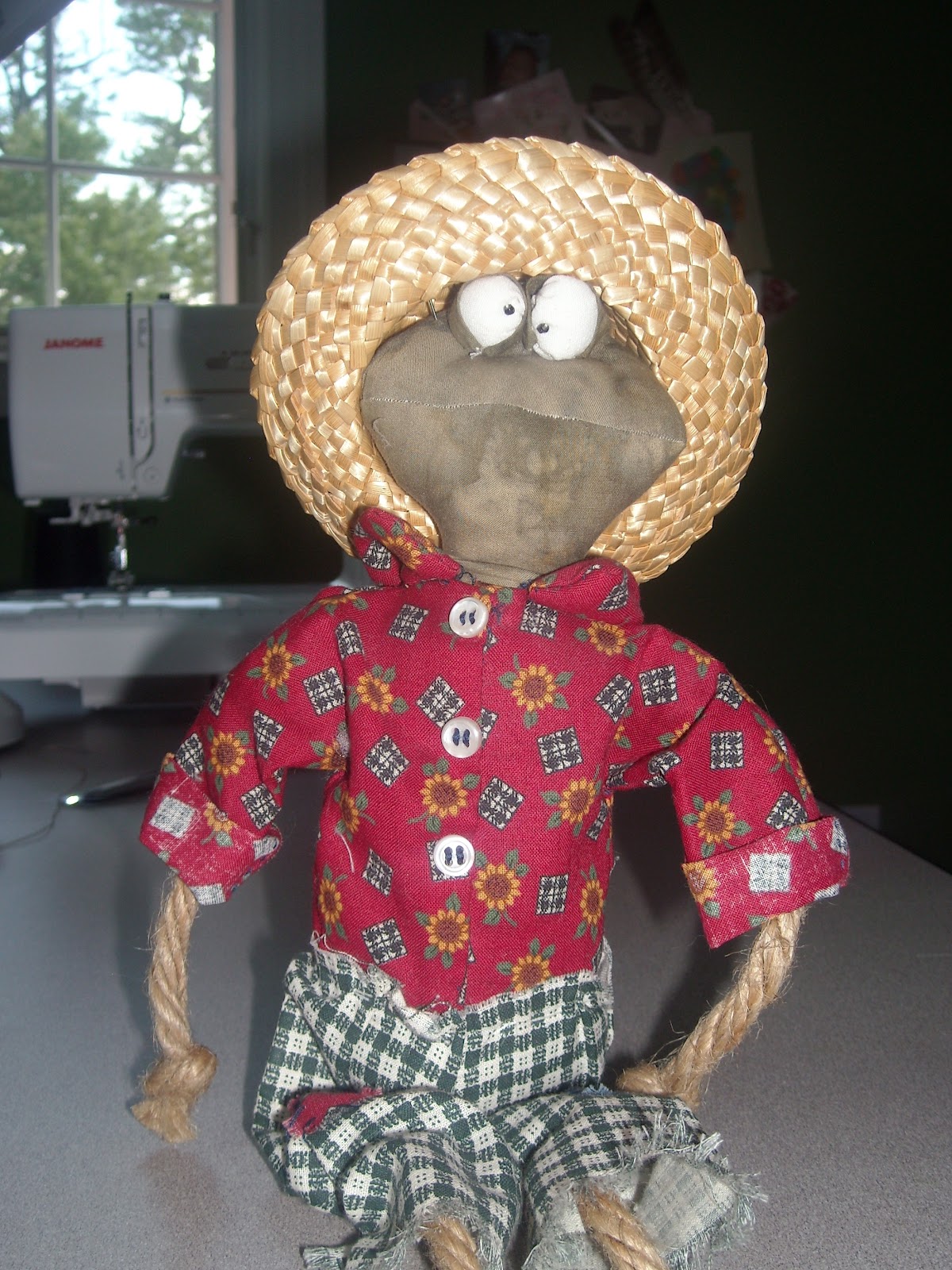
Not sure what is going on with me this week, but frogs have definitely been a mainstay in my creations this week. They are rather cute. This guy was from a pattern I bought a long time ago, started but never finished. It was supposed to be a present for my sister who is crazy for frogs. So if she wants this guy, she is going to have to come for a visit to get it! Ha ha!


He has a mate which is started. Should be another 10 years before I finish her though! Well maybe I can get it done by Christmas.

As a participant in a quilt art blog hop, I am submitting my current work in progress. To check out everyone else participating hop on over to Nina Marie's site


My last frog is actually a set of frogs. I pulled out a piece I had been working and and was in love with. Suddenly, after viewing it hanging up, I hated it. I pulled it off the design wall and buried it like I always do. When I get stuck on a project, I find that stepping away from it for a while will help me gain some perspective. This time it worked. I realized I did not have enough contrast and set about adding in more colors along with the contrast. I was happy when done but it was still missing something. Walking by my daughters african fighting frogs made me realize that was what was needed.
In second grade they learned about the life cycle of a frog and grew them into tiny little frogs. Once the unit was done, the kids were allowed to take some home. They were the size of a thumbnail. We took three which she promptly named Georgie, Gustavo and Fib. They are now the size of a large fist and need a bigger tank!


I spent an evening sketching the little guys. (I say evening because they move around quite a bit.) Once satisfied with the sketches, I traced them on some heavy vellum, cut them out and used it as a template to trace onto a greenish batik. The frogs have spots all over and I wanted a dimensional look, so I put a piece of batting underneath the frogs and free motion quilted around to create the patterning. Colors for the spots where done with fabric markers. The final part was to applique it onto the quilt. Just before sewing it closed, I added some stuffing inside to really pop them off the quilt.
I am loving this piece. I am finally ready to square up and finish it off! It feels so good to create something I love again!

Tuesday, August 14, 2012

Cucumber ATC trade - Cool As . . .


I decided on this little guy because the theme being cucumber meant that you could use all the colors in a cucumber which includes the orange flower! This project started with a sketch of the frog. I used acrylic paint to add color but it was too flat and needed some dimension and texture. I added details using colored pencils. Still kind of flat looking.

Referring back to pictures of the frog, I realized he was kind of shiny. Light bulb moment meant time for the glossy accent! I am glad I bought another bottle. I really love playing with this product! Looking good but still lacking the skin texture. That was solved while digging through my fabric markers for another project (which also includes frogs!) and I found my Puffy Velvet Pen! I haven't used this in a long time and it is supposed to be for fabric. Well rules are for breaking sometimes and I colored in the top half of mr. frog with it. It dried quickly. I love not having to wait. Hit it with a heat gun and wow! I nice rubbery type of texture. But what about the bumpy texture. So I added some dots all over the top and hit it with the heat gun again. Oh yeah!

Here is a side view to help explain what it looked like. Bet you want to reach out and touch it!
It rained all day yesterday so my cards bowed. Sigh.

Wednesday, July 18, 2012

Jonquil ATC

I seriously need to come out of this artistic funk I am in. Between the heat, kids swimming and allergies, I just don't seem to have any creativity left! I have stuff started or swimming in my brain but can't seem to get it moving. So the ATC trade came along and I plowed my way into it.

The trade was the color jonquil but for whatever reason, the flower was just stuck there. So I did what any hard working artist does, I went with it! The background is paper canvas painted with taupe and then a pale green. I used gel medium to adhere small squares of yellows and oranges. Originally this was going to be more abstract. The more I tried, the more it didn't work. So I sketched flowers using dark purple colored pencil and filled in the colors using oil pastels. I have to go play with them some more!  Hmm just had an idea for my Typography challenge!


The flowers were done in various shades of yellows and oranges. The background was with dark purple, sky blue and lime green. I trimmed around each with fancy scissors I swiped from my daughter and then mounted onto dark yellow card stock using orange eyelets. I love punching holes with that! The final touch was some silver, glitter dots in the center. Happy Summer!

Wednesday, June 6, 2012

Dew ATC


This months color choice was Dew. For whatever reason, I had an idea almost immediately and digging through the handmade fabrics, I had the perfect starting point. The fabric was a yellowgreenish color. I took fabric markers and drew leaves all over it with several shades of greens. Then I went in with darker markers around the leaves to make them pop out more. I did a free motion stitch around the leaves in green to add some texture. I cut them apart and drew spider webs on each card. I used Stickles glitter glue to get the sparkles of water or dew on the spider web. After it was dry, I put glossy accents on top of the glitter spots to make it more dimensional and like a drop of dew. I really love how these turned out. Don't forget to check this months entries at our blog Arts In The Cards!

Tuesday, June 5, 2012

More Stuffed "Thumbs?"

I really liked making the one stuffed piece based on a little girls drawing and decided to make a bunch more. I am even thinking of selling them. Me selling my art! This is indeed new to me. I really have to try that some more, otherwise I am going to run out of room in my studio and there really is only so much wall space in a home isn't there?!


I tweaked the design a bit and made them in three colors. Some have curly hair and some have straight! There are several other designs I have made. I just have to move from paper to fabric! Stay tuned!