This was a theme idea that I was excited about but worried about. I loved the idea because butterflies are so colorful and fun but didn't want to do an ATC with a picture of a butterfly. I have promised to stretch myself and these trades are very helpful. If you google images of butterflies, you get so many different types and it amazes me that I only see a few versions! But a few caught my attention when looking at them up close. The patterns on some have spots on the bottom wings that look to me like eyes. I love eyes and I love drawing them. They are so expressive. There was my starting point!
Each piece is on card stock. The eye was sketched in first with a light pencil and then a pattern was created around each. I colored in each with Sharpie markers! I never thought I would ever draw with markers but I love the details and colors I can get when overlaying. If I ever win lotto, I will buy sharpies in every color! Well after the color went on, I outlined everything with a finepoint black micron pen. For the eye centers, I used black puffy paint but left it flat so it would be shiny black. Additional details were made using glitter glue. I just couldn't pick a favorite to showcase so you only get the group shot.
Next up is my prayer flag trade but still struggling with ideas so it may be a while!
Showing posts with label ATC's. Show all posts
Wednesday, August 7, 2013
Thursday, July 11, 2013
Graffiti ATC - Typography
Yeah! New trade theme! Typography! Wait what?!! Oh man. Now I have to move outside the comfort zone again! (insert moaning and gnashing of teeth here!) Don't get me wrong. I love typography - when someone else does it. But when I have to do it - well it has to be perfect and I can't do perfection . . . . Ok OK so the award for best dramatic performance goes to ME!! LOL
I am actually pretty pleased with my interpretation of this theme. If you want to check out the others versions, swing on by our blog!
Graffiti is a cool version of typography that I can't really screw up too badly, so I sketched in the words heARTist trading group with a pencil and then traced with an embossing pen. Black embossing powder was sprinkled on top, then heat set. Sharpie markers added the colors. I outlined everything with a black sharpie to add dimension and with oil pastels to highlight. They were pretty good but I can never leave well enough alone. I painted Patty was here because I'm in the group, because I can and in graffiti, someone always comes along and messes with the masterpiece.
Labels:
ATC's,
embossing,
oil pastels,
sharpie markers
Friday, June 21, 2013
June ATC Challenge - Zetti
What? Zetti? I never heard of it! Google it! Oh wow! Not my style but truly a challenge. That was my thoughts on the next challenge. If you do a search for the term Zetti, a ton of remarkable art shows up. You can spend hours sifting through and get the feel of the art form.
Well I was intimidated to try which means stretching myself. Oh man. This is going to be hard. So I broke it down into small steps. First came the quote. I remember reading the quote or partial quote on Gisela (Towner? can't remember her last name!) It was a quote by Mark Twain:
She was not what you would call refined,
She was not what you would call unrefined.
She was the kind of person that kept a parrot.
Well this quote reminds me of my daughter Maddy. So I found a picture of her and scanned it. Made a bunch of copies and printed it out. Two elements done.
After I glued her onto the card stock, I was off and running. Sketched in the parrot and started coloring. I think that was my favorite part. I love color!
My daughter caught sight of what I was doing so I had to make some extra for her! Small price to pay I suppose!
Happy Solstice!
Labels:
art,
ATC's,
colored pencils,
daughter,
markers,
sharpie markers,
watercolor crayons,
Zetti
Saturday, April 20, 2013
Midwest Memories ATC
Our trade this month was actually a theme I picked. Everyone seemed to really push the envelope on the theme Sticks and Stones! See the others work here http://heartisttradingcards.blogspot.com/
Mine was based on the fencing used by along beaches. The idea came to me while driving through the midwestern farm belt! A little bit of a leap but still keeps with the theme.
The sky was a hand dyed blue fabric while the sand was made from rust dyed fabric. The fencing was a piece for brown netting I had saved from a potato bag. I used black thread and free motion stitched wood posts and wire to keep the fencing in place. The rocks were made from white puffy paint. I tried to puff the paint without melting the plastic. It worked in some areas and not in others. I think it adds to the rustic quality of the piece. Then I used different inks to get the coloring in the rocks and finished with walnut ink overall. I also used it to create shadow effects. The final touch was using glitter glues in browns and blacks for the sandy texture.
I framed each by sewing around the outside edges and painting the edges with red gold fabric paint by Jacquard. I think that color was a perfect match for the rest of the card. I am much happier with this round than last months!
Monday, April 1, 2013
Sky ATC-Reflections
The sky is one of my favorite things in the world. But when it came to this trade, I was kind of stuck. I guess I had too many ideas of which way to go, that I just couldn't pick one. Inspiration struck one morning as I was walking out to my car, on my way to work. It had rained and a puddle of water was in the street. I saw the reflection of the sky and trees and well, that was my idea. The execution was a little more difficult.
Digging through my fabrics, The perfect fabric presented itself. A batik in mainly white with blues, greens and golds running through it. I stamped the fabric with a tree stamp I had on hand using a purple ink. Once dry, the background was painted in using a light gray acrylic. The fabric part was then given two coats of glossy accents, with a few drops around on the "pavement". It was kind of boring, so I added in a purple ink around the water to make it pop more.
It was still boring and needed a pop of color. So back to my drawer of odds and ends, yielded these paper leaves. I added them using the glossy accents and it gave another layer of interest to the design. The edges were finished off using a copper shiva paintstik.
Happy Spring Everyone! We are still waiting for it to "spring" here!
Labels:
art,
ATC's,
fabric,
fiber,
glossy accents,
hand painted,
shiva paintstiks,
stamps,
trees,
water
Wednesday, February 6, 2013
Verdigris ATC - Year of the Snake
I thought this color idea paired nicely with the Chinese New Year. This is the year of the Water Snake. I did something a little different this time. I took pictures of my process in creating this ATC. Why? I have no idea but I have had quite a few questions on how they were created so this will give you a visual step by step.
I didn't take pictures of the process after this. I used chinese stamps for prosperity and double happiness using red and gold inks. Then hand painted in the Chinese symbol for the snake (I love the internet!) and Year of the Snake.
Here are the final finished pieces:
Happy Chinese New Year!
| This is step 1. I fused pink fabric to peltex and used puffy paint to create a snake. |
| Step 2 is puffing up the paint and then painting over the whole piece with copper paint. |
| This was step 3. I painted the verdigris color over the top in a mottled kind of way to recreate the patina. |
Here are the final finished pieces:
| The group shot |
| There was too much black so I used orange glitter glue over the top for a little extra punch. |
Sunday, December 30, 2012
Celebration! - Tiger Lily ATC
Happy New Year! 2012 was a series of highs and lows for me this year and I celebrate them all. Adversity makes us grow while the wonderful events give us pause to celebrate and the momentum to keep moving forward.
Tiger Lily was the color for December and in keeping with my celebratory mood, I used the center of the flower as inspiration. If you look closely, the center looks a little like a fireworks display from an airplane! My other inspiration was the commercial fabric I used for my background fabric. I bought this fabric and quite a bit of it. It seems to find its way into my work now and again. I think it must be the color combination. I reminds me of fall, water and sunlight hitting water. Aqua and orange just vibrate against one another.
I drew in the center using a dye pen in black. To create more explosion and keep with the colors of the flower itself, I painted the centers with poppy red ink using a thin brush. I had to put those black spots in there which reminded me of looking down at people on the ground. They look like little ants! Black puffy paint was used for the spots. The yellow represents the fireworks as they shoot into the sky and right before they explode into beautiful colors. I used a yellow puffy velvet pen for those. Once they were dry, I hit it with a heat gun to puff up the black and yellow. Very cool texture. Instead of using my sewing machine to finish off the edges, I decided to paint them black using textile paint.
This marks the end of our second year of trading ATCs in our group. Please check out the rest of my groups interpretations at www.artsinthecards.blogspot.com
Thursday, December 27, 2012
Stormy Lake ATC
Wow! This is embarrassing. I haven't posted anything since August. My sincere apologies. My kids, work and life took over. I didn't even participate in two months of ATC trades because of all the events in my life, but I am back on track. I did manage some creative endeavors though and the Lake trade was one of them.
As you know, we have been using colors as our prompts this year. Lake was one I was looking forward to doing. I love all the colors and reflections that are involved in lake.
The base fabric was a commercial brown material that had swirls and spots that reminded me of the bottom of a lake. I took a shimmery dark blue sheer fabric and scrunched it, pinned it in place then sewed it with dark blue thread. I did the same with a light turquoise sheer to finish off the top part. The lake has these colors when a storm is blowing in. I brushed interference blue paint across the tops for a wave like action. The final part was Glossy Accents to add the shine of water on sand and a few seed beads dropped in for texture. This turned out to be one of my favorites that I have done.
Maybe a larger version of this piece would be nice and donate to the swim team for fundraisers!
Labels:
art quilt,
ATC's,
beaded,
embellished,
fabric,
fiber,
glossy accents,
water
Tuesday, August 14, 2012
Cucumber ATC trade - Cool As . . .
I decided on this little guy because the theme being cucumber meant that you could use all the colors in a cucumber which includes the orange flower! This project started with a sketch of the frog. I used acrylic paint to add color but it was too flat and needed some dimension and texture. I added details using colored pencils. Still kind of flat looking.
Referring back to pictures of the frog, I realized he was kind of shiny. Light bulb moment meant time for the glossy accent! I am glad I bought another bottle. I really love playing with this product! Looking good but still lacking the skin texture. That was solved while digging through my fabric markers for another project (which also includes frogs!) and I found my Puffy Velvet Pen! I haven't used this in a long time and it is supposed to be for fabric. Well rules are for breaking sometimes and I colored in the top half of mr. frog with it. It dried quickly. I love not having to wait. Hit it with a heat gun and wow! I nice rubbery type of texture. But what about the bumpy texture. So I added some dots all over the top and hit it with the heat gun again. Oh yeah!
Here is a side view to help explain what it looked like. Bet you want to reach out and touch it!
It rained all day yesterday so my cards bowed. Sigh.
Labels:
ATC's,
colored pencils,
frog,
glossy accents,
hand painted,
puffy velvet pen
Sunday, April 15, 2012
If April Showers . .
bring May Flowers, what do May Flowers bring? The pilgrims! I still remember that joke from my childhood! Corny but cute. So our latest trade was Rain. Rain as a color really stumped me for quite a while. Well until I realized that it really is clear and picks up the colors it lands on. So I used the idea of a driving rain against a window.
I used a hand dyed fabric I made a long time ago in blues, whites and a pale pink. Details were added with watercolor crayons and water. Once dry, more details were added with fabric markers and then free motion stitching in metallic blue. For the highlights and sparkle I used a scrapbooking product called Stickles in star dust (fancy term for off white!) That had to dry overnight. Additional dimension was created with markers in blues and some pinks. I knew it would be impossible to get the sparkle into the photograph but gave it the old college try. This was as good as it gets unfortunately.
Labels:
art,
ATC's,
fabric,
fiber,
hand dyes,
mixed media,
sharpie markers,
water color crayons
Monday, February 27, 2012
Key Lime Pie ATC
Our theme for this month was LIME. This year, we have deviated a bit from our usual theme and we will only be doing colors. I guess they were sick of my finding a way to make a tree out of every challenge! Just kidding. (But limes grow on trees . . . )
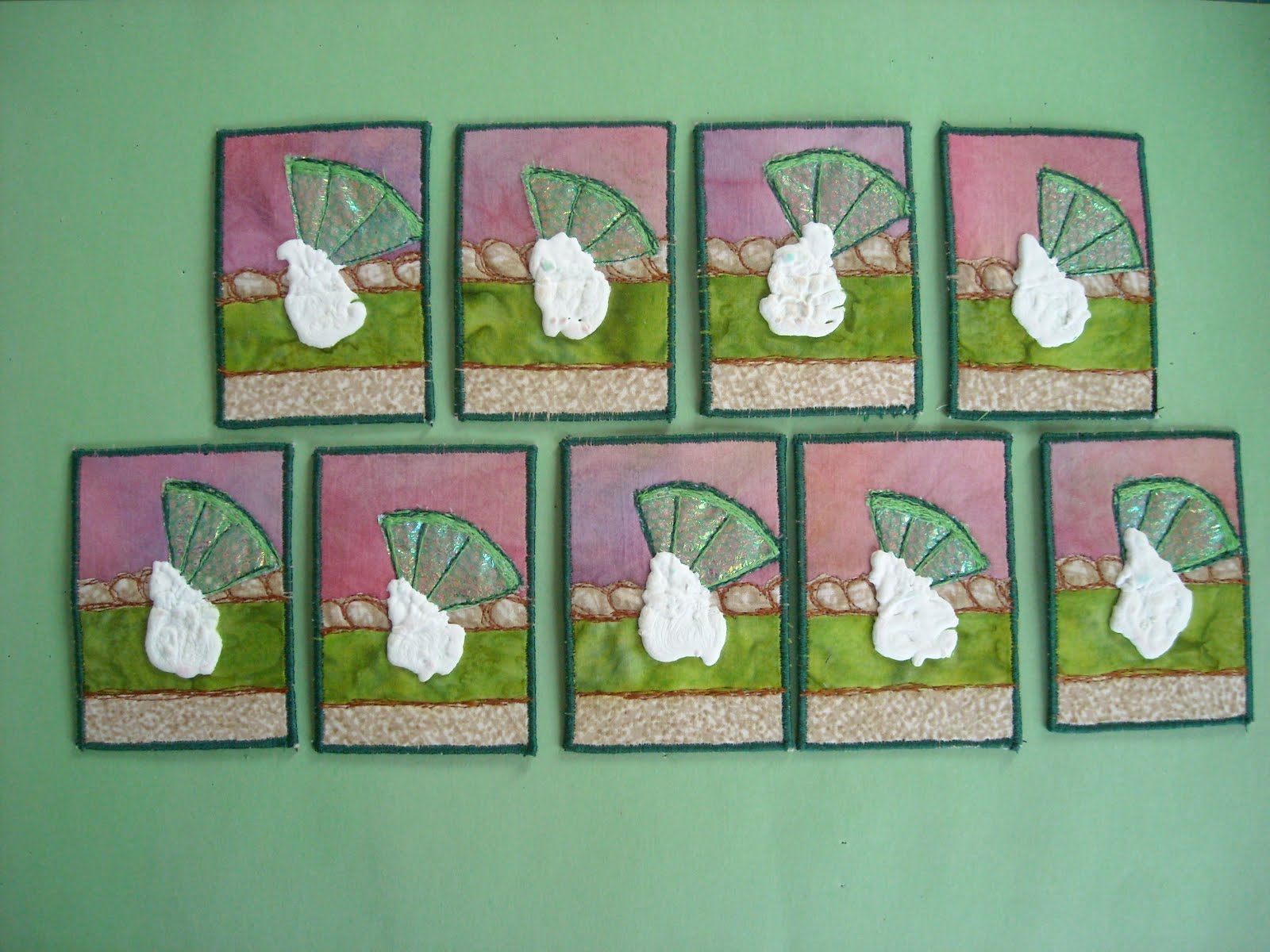
I constructed the pie using a hand dyed pink and purple fabric for background, lime batik for the pie and a cream and light brown for the crust. There was too much of a pattern on the bottom part of the crust so I used a brown dye pen to even it out a bit. I added detail to the crust by using a free motion stitch in rust to add another dimension. The lime was made from fusing a rainbow cellophane from a flower arrangement and green netting together. Free motion stitching in lime green added the details. I then quartered the circles so they would fit on each card. More detail was added using a dark green thread to stitch it to the card. The final piece was to use my favorite puffy paint to make whipped cream. Good thing I made extra pieces to test on because I ruined a couple when I was puffing up the paint!
See the other Lime pieces at Arts In the Cards blog!
Sunday, January 29, 2012
ATC - Red
This year the group is going to do colors for the trades each month. Red is the color for February - how appropriate. My piece is titled PASSION which red always seems to signal to me.
I stamped all over my batik fabric scrap (which was in shades of red, orange and brown) with a handmade stamp. The stamp reminds me of something inside our brain that is all connected. When dry, I placed a red mesh fabric from a floral arrangement, over the entire piece and free motion quilted around the stamp and filled in with different sized circles using black thread. I cut them apart and added Glossy Accents onto the stamped parts to bring out the red. I think this may be one of my favorites! I loved out it turned out.
Don't forget to check out all the others at http://artsinthecards.blogspot.com
Friday, January 6, 2012
ATC - Two

I had to decline participating in our December trade which was a flat Santa trade. They were absolutely adorable. But everything is calming down once again and our January trade was TWO to celebrate our 2nd anniversary. I can't believe we have been doing this for two years already! So many wonderful pieces were traded!
My contribution for the two trade was based on the anniversary and what does one give on the second anniversary. How interesting that it is cotton! So I used cotton fabrics to create little cotton plants to give on our second anniversary. The background was my flour paste resist in blue for the sky, then a metallic green for background plants and a combo rust dyed with tanin on white cotton for the earth colors. I used puffy paint for the plant and cotton balls sewn in for the cotton of course.
I have managed to misplace my camera so a friend was kind enough to use her camera phone to take a picture for me. So no group shot this time around. Sorry
Labels:
art,
ATC's,
dyed,
embellished,
fabric,
fiber,
rust dyed fabric
Saturday, December 10, 2011
Grateful ATC Challenge
Wow have I been busy! I forgot to post this to my blog (and the trading card blog! Whoops!)
Our theme for November was Grateful which is appropriate for the Thanksgiving season. I struggled trying to find a way to incorporate all that I was grateful for into a small space. When I thought about what I was most grateful, the idea snapped into place. I am grateful for each and everyday that I have to spend with family and friends! (Insert smacking of forehead here) Here is the link to all the grateful ATC entries: http://artsinthecards.blogspot.com
I used cardstock and colored the background with sharpie markers to create sunrise/sunset and mountains. More details were added with colored pencils and then a pine tree was stamped in dark brown. The final detail was the birds drawn in with a black pigma pen.
Our next trade is a Flat Santa exchange! The pieces so far have been so cute and adorable. I unfortunately had to sit this one out as I had quite a bit going on. They should be going up in the next week or so. Stayed tuned!
Monday, October 3, 2011
Radiance-Hardware ATC Challenge
I would have done this sooner but my email account seems to have disappeared. Of course, everything was attached to that address and my last week of life has been somewhat of a nightmare! GGrrrr
But I managed to soothe my jangled nerves and produce a piece for this challenge. We were supposed to be using hardware. Stuff you find at the hardware store. Keeping in mind that this is a small piece and that it has to go through the mail, really limits what you can use!


I started out with a piece of hand stitched rust dyed fabric. The piece was started and blown off a while ago. It just wasn't working. So I measured out my cards on the fabric with a black marker and screwed one of them up by not double checking the size before hand! That's why I make extras for mistakes such as these. I wound some copper wire that was from a picture frame hanging kit (at least I think that is where it came from!) Boring. Painted some washers in metallic blue and hand stitched them on. Better but still boring. Looked at the one that I wrote on and realized if I made an intersecting line running down, I would create a focal point. Hmm. More washers, and blue metallic thread gave me the wonderful masterpieces I finally ended up creating! Please note that this is the second ATC in a row that was not a TREE!! I am really growing! Hee-hee
But I managed to soothe my jangled nerves and produce a piece for this challenge. We were supposed to be using hardware. Stuff you find at the hardware store. Keeping in mind that this is a small piece and that it has to go through the mail, really limits what you can use!
I started out with a piece of hand stitched rust dyed fabric. The piece was started and blown off a while ago. It just wasn't working. So I measured out my cards on the fabric with a black marker and screwed one of them up by not double checking the size before hand! That's why I make extras for mistakes such as these. I wound some copper wire that was from a picture frame hanging kit (at least I think that is where it came from!) Boring. Painted some washers in metallic blue and hand stitched them on. Better but still boring. Looked at the one that I wrote on and realized if I made an intersecting line running down, I would create a focal point. Hmm. More washers, and blue metallic thread gave me the wonderful masterpieces I finally ended up creating! Please note that this is the second ATC in a row that was not a TREE!! I am really growing! Hee-hee
Labels:
art,
ATC's,
embellished,
fabric,
fiber,
ink,
rust dyed fabric
Tuesday, July 26, 2011
Death/Rebirth - Opposites Challenge
Time for the monthly posting of my ATC trade! See the rest here: http://artsinthecards.blogspot.com
This month was Opposites. I thought it would be an easy one to do but I ended up struggling with it. I was not feeling very creative as the day before this was announced, we learned of the sudden death of my BIL Paul. My husband was devastated as he had just lost his father 8 months prior. Events like this always gives us pause to contemplate the cycle of life and other things.
Driving home from the store, my attention was caught by a dead tree spiraling quite high into the sky. It was quite striking against the blue sky with fluffy clouds. I am sure it was a very stately tree with a very interesting past - kind of like my BIL. Below the tree, there were tiny trees, shrubs and flowers growing up all around the dead tree. So that became my theme - death/rebirth. Interesting how after death, other things show up to fill the void.


I used a fabric I dyed with blue dye and a flour paste resist. The trees are made from black and white puffy paint added on top of one another. At the base of the tree, I couched green yarn to create to shrubs and silk scraps are held in place with beads to create the wildflowers. I beaded some additional sprigs of orange flowers to add to the image.
Rest in Peace Paul Cox.
Your outrageous personality and quick wit will be dearly missed.
This month was Opposites. I thought it would be an easy one to do but I ended up struggling with it. I was not feeling very creative as the day before this was announced, we learned of the sudden death of my BIL Paul. My husband was devastated as he had just lost his father 8 months prior. Events like this always gives us pause to contemplate the cycle of life and other things.
Driving home from the store, my attention was caught by a dead tree spiraling quite high into the sky. It was quite striking against the blue sky with fluffy clouds. I am sure it was a very stately tree with a very interesting past - kind of like my BIL. Below the tree, there were tiny trees, shrubs and flowers growing up all around the dead tree. So that became my theme - death/rebirth. Interesting how after death, other things show up to fill the void.
I used a fabric I dyed with blue dye and a flour paste resist. The trees are made from black and white puffy paint added on top of one another. At the base of the tree, I couched green yarn to create to shrubs and silk scraps are held in place with beads to create the wildflowers. I beaded some additional sprigs of orange flowers to add to the image.
Rest in Peace Paul Cox.
Your outrageous personality and quick wit will be dearly missed.
Friday, June 24, 2011
Sunflowers and Lemonade ATC Challenge
I had to take our newest challenge and change it up a bit. We went down to Louisiana for my hubands father's memorial service. Between the heat and family, we were getting a little crazy. So once we were free to go, we jumped back in the car and headed to New Orleans - the French Quarter to be exact and the Court of Two Sisters. Love that place and we ordered a hurricane! Just what the doctor ordered! So leaving there inspired, I decided to make my ATC's using the adult version of lemonade! LOL
I sketched the design in colored pencil, colored everything using sharpie markers and then over the table and background with oil pastels - blending with my fingers. I sketched over the whole design with colored pencils to add in all the details. The word was stamped on and then highlighted with oil pastels. The final touch was adding Glossy Accents by inkssentials to create the "sweating" on the glass. Enjoy your summer!
Sunday, May 1, 2011
Spring - Kinda
Lot's of crazy stuff going on in my life right now! So I have a few things to post about. This is the latest of my ATC trading cards. Looking at them now, they really look so much like a set I did last year. I must have really liked that one!
The theme was in Just Spring based on ee cummings poem. I just didn't have anything springlike happening. We have had nothing but rain and overcast days. It has been depressing to say the least. Everyone has been just in a funk and it is well represented in my latest ATC's.
I used hand dyed fabric and did a rubbing on it with a leaf plate. It was boring. So I fused it to the peltex and cut to individual cards and stamped leaf prints using commercial and hand cut stamps in brown and light green. I really liked them at this point but then was at a loss on how to proceed. I just wasn't in a spring frame of mind. Finally I decided to just go with it and used fabric crayons and sequin waste to add in "flowers" in red, blue and yellow. I smeared on a sparkly glitter glue to represent the standing water. I heat set, then free motion stitched grasses as this seems to be the only thing growing right now. My single shot is a little blurry again. I think I may be having some problems with my camera. It is also tough to get good shots when the weather is so dark and dreary. But we are on our 2nd day of sunshine so things are looking more like spring! Finally!!
Friday, March 18, 2011
ATC Super Moon
This is sad. I am only posting about the ATC's I'm making! I have been doing other stuff but can't post as I am busy trying to send pieces in to shows. I am actually being brave and answering calls for entries. I will keep you posted.
So this challenge is using the color Indigo! Oooooo!!!! I love indigo. It is so dark, moody and mysterious. Everyone has been talking about the super moon coming up on March 19th and I knew my theme was set. First I found some woven fabric in indigo with a faint shot of gold. I added in wavy lines with my sewing machine to create the snowy landscape. Next was a free motion stitched tree and a moon using black puffy paint. Why black you ask? Well, once you paint over the black with white, some of the black will come through as grey creating the surface of the moon coloring. Well it does in my mind and doesn't show up as well in my photos. Finally, I added white and blue to the ground using shiva paintstiks and blended. Then I decided to add in some clouds behind the moon and used white, blue and a touch of black and blended for a muted background. I am very happy with how these turned out.
Labels:
art,
art quilt,
ATC's,
fabric,
hand painted,
shiva paintstiks,
trees
Sunday, February 27, 2011
Hanging On - Reduce, Reuse, Recycle
Finished my next set of ATC's and I am way ahead of schedule on this one but still not first one done! LOL What can I say, life is throwing me some serious curve balls this month!
Our theme of reduce, reuse and recycle is pretty self explanatory. I blogged about my process on the group blog is you want to know more! http://artsinthecards.blogspot.com/
Check out everyone else's interpretations! They are really cool!
Labels:
art,
ATC's,
dyed,
embellished,
fabric,
fiber,
mixed media,
trees
Subscribe to:
Posts (Atom)