Thursday, January 31, 2008

More Fabric Experiments!

I decided to do a few more fabric paintings. I used the Neocolors because I am in love with the final finished pieces.


This was a blend of colors from yellow through purple. Just drawing from corner to corner. I was impatient and heat set it before it was totally dry and ended up getting these cool shapes in the colors.


This was a winter looking piece. I used rubber stamps and the neocolors and did rubbings of the trees. I added more details in to make the trees more lifelike. I heat set with an iron and then drew colors into the background. Once I was satisfied with the colors, I used a brush and water to blend the whole piece. Heat setting the crayons kept the trees from bleeding.
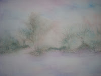


This was the backside of the fabric. The trees looked more mysterious and less like trees. Interesting possibilities.


Christine (the chick who needs to buy a vowel in Walnut Creek) has been trying to get me to join the TIF Challenge. I didn't get in but I am in on the waiting list. I really didn't have an idea of what I wanted to do until I started playing with my crayons. So I created the background with the color theme, added water to blend and let it dry. When it was dry, I did rubbings of various trees to create a scene. I heat set with an iron. Now I have to finish this off. So many ideas, so little time . . . .

Wednesday, January 23, 2008

Collage II Mania


Two posts in one day! Wow! This must be a record for me. Well I am busy trying to work on some of my projects that I started and never finished. Those UFO's are staring me in the face and one of my new years resolutions was to finish off these projects.
I found one of my UFO's and incorporated it into a collage for Virginia Spiegels Collage Mania II. It is a fundraiser for the American Cancer Society. As I am coming up on the second anniversary of my fathers death from hepatic cancer, I thought it would be nice to honor him with my art. I'm afraid I am not the greatest photographer and the sun has been very absent so getting a good shot was extremely difficult.

The rocks were created with puffy paint on fabric backed with a stabilizer and then painted black, then blue and then some gold for highlights. The water was created using liquid sculpey. After I heated it and let it cool, I went back in the the water and colored it with dye pens then beaded it in some place for smaller rocks.

The rectangles were fabric backed paper. The tissue paper was white and I painted it with metallics to pull out the colors in the rocks. I painted scrim with metallic copper and placed that over the three rectangles. All four pieces were mounted using gold and copper eyelets. A small clock was hung from the middle rectangle. I made large x's in the rectangles and framed the rocks with the same orange yarn. Everything was mounted on watercolor paper that was washed in blue paint.

The rocks represent my father and his love of water. He liked to fish and was also in the navy. He loved nature! The rectangles represent time marching on. The x's and the clock symbolize that our time with him is now over. I framed the rocks to show that even though he is gone, he is still in our hearts and in our memories (like a photograph).

You can check out all the action on this at Virginia's website : http://www.virginiaspiegel.com/NewFiles/ACSFundraiser.html
All donations are for the American Cancer Society.

Painting Fabric


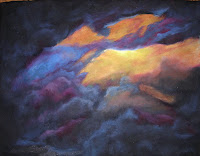
It has been such a dreary and gloomy winter. Every weekend has had some major weather maker. So I was longing for some bold, bright colors and decided to paint some fabric. This first one is a storm rolling in while the sun was setting. This was over the summer when we had this crazy storm blow through just south of us. I painted it on black fabric so it is much more moody than intended but really loved the results.
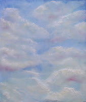
The next two are fabric paints in a couple of blues. I watered them down and then painted white fabric. After they were dry, I went back in with more fabric paints in different muted colors and blended them into the areas that were lighter to create clouds. I hadn't realized I had used the velveteen white until I went to heat set the pieces. Velveteen will puff up slightly to give you a texture. So now my clouds have a little more depth to them.
The last two were done with Caran d'Ache Neocolor II water color crayons. I just started drawing with them. The seaside was done on a piece of fabric I had painted with watered down fabric paint. I was experimenting to see if I could go back into it with the crayons. I pulled out details to create clouds, land and sand. Very moody. The other was just playing with the various oranges, reds and purples with some blues in for good measure. I love how vibrant this came out.
My husband bought me these crayons on a whim one day and I about fainted when he came home with them. He had no idea I had been coveting them ever since reading the article by Holly Knott in the QA magazine!! Sometimes I think we share the same brain!!

Tuesday, January 15, 2008

True Colors Paper Quilt


So I bit the bullet and tried to create another paper quilt this year. As always, Quilting Arts throws out challenges and some speak to me more than others. This one yelled at me! I found some cheap muslin fabric and painted it in vivid oranges and yellows. After that was dry, I applied watered down glue to the surface and started laying in tissue paper in various colors to accent what I had going on. Somewhere in my mind I thought I was creating a sunset in the clouds but realized it was more of a lava flow about to erupt. This was much closer to my true colors. After I was satisfied with the look, I let it dry completely. It was so beautiful, I was afraid to touch it. Finally I bit the bullet and went for it!!
First, I accented areas with stitching in a random order but close to the same colors I had going on. Wow! Again, I was afraid to touch it. It took a full week to get back to it. I started playing around with various threads and this blue rope just jumped out at me and made the orange vibrate. I love, love love!!! orange and turquoise together. So after finding a composition I liked, I stitched it down. I use a smaller metallic thread at the top to blend the two areas together. After that came the beading. Big, chunky orange and blue beads and a bunch of different smaller accents.
The edges were finished with a navy blue stitching and a multicolored yarn.